Different by Design
America’s resurgent left charts its own visual course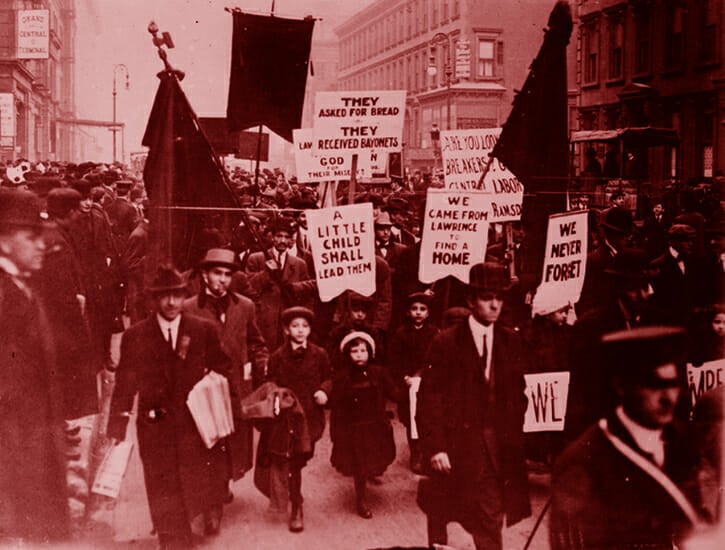 Lawrence, Massachusetts "Bread and Roses" strikers in New York City, 1912.
 o
r
d
F
a
c
t
o
r
y
Few political stars are born in such storybook fashion: a twenty-eight-year-old bartender and community organizer runs a long-shot primary challenge against a powerful, inveterate incumbent, gets massively out-fundraised—and wins. On the evening of June 26, 2018, breathless reactions poured in over Twitter and on cable news chyrons as Bronx-born democratic socialist Alexandria Ocasio-Cortez was improbably named the Democratic nominee for New York’s 14th?Congressional District.
On my own Twitter feed, an intersection of rose emoji and graphic designers, two victories were being celebrated that night: AOC’s, and that of her campaign logo. The logo—an exuberant, upward-tilting stack of her name, “?Ocasio!,” framed by a boxy purple speech bubble—along with the accompanying posters that had been posted up in various locales across the Bronx and Queens in the lead-up to the election, has been the subject of more media attention and praise than perhaps any other political logo in the decade-plus since the iconic Obama “O.” Two days following her primary win, theWashington Post declared Ocasio-Cortez’s triumph “a rare example of good design on the campaign trail,” while Vox called the design “brilliant.” Writing in n+1, Rachel Ossip and Mark Krotov celebrated her campaign as “major step forward for graphic design in American politics.” The design has since inspired international copycats, such as French Communist Party spokesman and Paris deputy mayor for housing Ian Brossat’s nearly identical posters.
The revitalized left that has emerged in the wake of Donald Trump’s election faces many existential questions more pressing than the aesthetic ones; unless you happen to be a socialist graphic designer, design likely falls to the bottom of the docket. But as the most precipitous spike in organizing numbers and public visibility of American socialists since perhaps the early twentieth century continues—and is noted, with laurels or anxious scrutiny, in the pages of publications like The New Republic, The Nation, The Atlantic, The Economist, and New York magazine—I can’t help wondering what the future of American socialism will looklike, in the literal sense.
“People know when authenticity is being forced on them.”
The current visual language of the left is vast and decentralized; there are branded campaigns such as that of Ocasio-Cortez, large grassroots organizations like the Democratic Socialists of America, union iconography rooted in the early twentieth century, glossy leftist magazines, and scrappy viral memes. “There’s not a central design voice [on the left],” says Andy Pressman, a designer who formerly served on the DSA National Design Committee and has designed book covers for the radical publishing house Verso. If there is anything that binds these disparate styles together, it might be the historical influence of the American left’s past. Conspicuous nods to the labor movement and to New Deal-era art are present across genres, from the DSA’s Bernie Sanders campaign buttons to Representative Ocasio-Cortez’s recently announced series of Green New Deal posters; created by Tandem, the design firm responsible for her campaign branding, they explicitly emulate the deco style of the posters produced by the Works Progress Administration’s Federal Art Project.
In some ways, the varied field of leftist design is a reflection of its democratic character. “I think design is becoming participatory again,” Pressman continues. “It’s not like you would have a design shift that anyone would find noticeable were there not a shift publicly to the left. I think more important [than particular trends] is the idea that design can be produced by anyone.”
That philosophy is in stark contrast to the design practices of the mainstream Democratic Party. As I’ve previously written, the Democratic National Committee, in the years following Obama’s extraordinarily brand-conscious, visually consistent campaign, came to realize the importance of developing a coherent visual identity that immediately distinguishes them from their Republican counterparts. The slick design language of today’s Democratic candidates echoes the corporatized sterility of the party itself, a result of overwrought, overly focus-grouped work. Designer Erik Carter points to Pete Buttigieg’s much-discussed branding (and the much mocked placeholder text on his website) as well as Hillary Clinton’s omnipresent 2016 “H” as examples of campaigns that failed to convey a galvanizing message with their branding.
“Buttigieg has attempted [to reflect an authentic message] with a toolset from a Brooklyn design studio that feels as inauthentic as Pentagram’s attempt at Hillary’s logo,” says Carter. “People know when authenticity is being forced on them.”

While Clinton’s team had considered every possible angle for her logo and striven for perfect inoffensiveness only to be met with scorn and criticism, Trump skated to victory with outright horrendous design. “Bad typography; amateurish design; haphazard, inconsistent, downright ugly communications,” wrote Michael Bierut, a Pentagram partner and creator of the Hillary “H,” for Design Observerin 2017. “The Republican convention was a gruesome and tawdry spectacle. And everything was topped off with nothing more than a red hat with a badly kerned, caps-locked slogan.”
The right, for its part, seems to delight in amateur garishness. The ugliness of Trump’s logo and his MAGA hats is not so much a sign of incompetence—though that likely is part of the equation—as a concerted effort to appeal to a base whose chosen aesthetics include Pepe memes, Tiki Torch-lit white supremacist rallies, and cursed Boomer images. Beside Trump’s visual branding trash fire, the polished 2016 primary logos of Ted Cruz and Marco Rubio couldn’t help but look unfashionably establishment.
The challenge for leftist design, then, is to chart a visual course distinct from both the garishness of the right and the empty sleekness of the center—design that champions and reflects the demands of a candidate’s prospective constituents (or an organization’s members and prospective members) without getting in the way of the message. Ocasio-Cortez’s design team took inspiration from the uplifting but unpolished visual language of the American labor movement, with particular attention paid to the National Farmworkers Association (now part of the United Farmworkers of America). She isn’t the only candidate to successfully strike the balance since 2016: Rep. Ilhan Omar made delightful use of a lilting cursive logo for her 2018 campaign, while Bernie Sanders’s friendly and inviting slab serif stands out in a presidential field divided between a few traditional serif types and many modern sans serifs. On the local level, recently elected socialist Chicago aldermen Andre Vasquez and Byron Sigcho-Lopez broke the mold this year with unique color palettes incorporating the near-compulsory Chicago six-pointed star.

Beyond the realm of electoral politics, design plays an important role in spreading leftist messages and catching the attention of the potentially persuadable. Leftist media, still emerging from the cocoon of the subcultural, is now faced with the challenge of synthesizing their messaging with visual interest—without reverting to the all style, no substance aesthetics of liberalism. Since 2011, Jacobin’s covers and spreads have worked to reclaim the minimalist, kinetic style that big tech has spent the better part of a decade laying claim to, while Current Affairs (as well as this magazine) meets Jacobin’s minimalist elegance with its own brassy opulence and lush illustration. Over on the cesspit that is YouTube, Natalie Wynn of the sometimes controversial ContraPoints channel delivers anti-right-wing diatribes while performing camp extravagance, with high production-value costume, set, and lighting design in the mix.
The challenge for leftist design is to chart a visual course distinct from both the garishness of the right and the empty sleekness of the center.
Some of the more grassroots-level innovations in leftist political design can be found in the orbit of the Democratic Socialists of America, whose membership has grown exponentially since 2015. The DSA embraces its socialist legacy with a black, white, and red color palette. Its iconography—the quintessential red rose, hands clasped in unity or raised in a fist, bread and/or grain (a reference to the iconic 1912 Bread and Roses Strike, during which textile workers in Lawrence, Massachusetts, fought for better wages and overtime pay)—is presented across myriad DIY pamphlets, posters, and booklets, in just as many styles, freeing it from the fuss endemic to a design system like Pete Buttigieg’s.
“It turns branding on its head,” says Pressman. “Whereas usually branding is about a consistency of application and approach, this is about a consistency of intent and spirit.”
But the most revolutionary aspect of the DSA’s design is not so much what appears on the page or poster or screen, but how it came to be there. With the visual assets made widely available across the organization, the brand attributes limited in number and easy to build off of, and the pressure for perfection or strict consistency absent, the realm of design is open to a wider range of perspectives while remaining rooted in the goal of facilitating political action. “People talk about democratizing design tools, and usually they mean making it so that anybody can make a pamphlet or a poster, and that’s great,” says Pressman, “but I think the more interesting part of democratizing design is that participants in political action are themselves designing the stuff that’s being used by those actions and those people.”
Today, many of America’s young leftists are working to bring about a more radical continuation of the New Deal ethos. Should that history serve as any indication, the proliferation of art and design will play a crucial role in the years to come, as we find our footing and grow our ranks. For it is bread we fight for, as the song goes—but we fight for roses, too.